
The contrast in art is by many considered to be the golden rule for creation. In this article, American contemporary artist David Berkowitz Chicago will talk about the contrast of colors in greater depth. Its inclusion in painting, as we well know, is the most elementary. Or can you imagine a painting where there is no contrast? If so, you probably ended up imagining a single-colored square (and that’s if you managed to imagine it without any surroundings).
This is why contrast is one of those fundamental color issues that you have to study before taking up painting professionally. There is a whole field of study behind it and if we use their contributions, our works could be as vibrant.

With clever use of contrast, you can focus attention on your key features in a painting. Knowing when to create a stunning contrast and when to leave an area slightly uninviting is a powerful skill that separates good artists from great artists. In this post, David Berkowitz Chicago dives a bit deeper into the different ways to create contrast and how to use it to improve your paintings.
First, David Berkowitz will explain why contrast in art is important, then he will share all the different types of contrasts you can achieve, and finally, you’ll have a few prompts for creating contrast on your artworks.
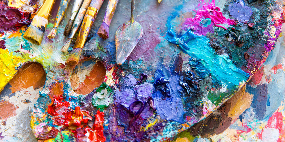
We speak of contrasts when we can see between two color effects that are being compared, differences or sensible intervals. When these differences reach a maximum, it will be said that it is an opposition contrast or a polar contrast. Thus, the hot-cold, white-black, small-large oppositions taken to the extreme are polar contrasts. Everything that we can capture with our senses is based on a comparative relationship. A line seems long to us when there is a small line next to it, but the same line will seem short to us if it is accompanied by a long line.
Johannes Itten, designer and professor at the Bauhaus, is the first to make a theory about the types of possible contrasts that are produced by the different characteristics of colors. Johannes distinguished seven types of contrast: saturation, temperature, simultaneity, quantity, luminosity, placement on the color wheel, and color quality.
As an artist himself, David Berkowitz Chicago is fascinated by paintings that have a sharp contrast between light and dark. Exploring the arrangement of different parts, such as light and dark, opposite hues of the color wheel, texture, and size, he uses contrast to create the rhythm or to strengthen the focus of his artwork.