
The illusion of distance in painting is an achievement that took Western artists several centuries to achieve. However, today few are those who master it and for this reason, it is a significant tool for painters.
For many representational artists—David Berkowitz Chicago included—the biggest hurdle to successful and believable artwork is creating the illusion of space, which is also known as pictorial depth.
At one point, twentieth-century avant-garde artists and theorists tried to break completely with the illusion of distance within the canvas to take the painting in a direction other than that of figurative representation. They considered that painting should completely free itself from figurative illusionism and surrender to the fact that it lives on a flat canvas and therefore, it must be flat, without illusionism. Many new styles, methods, and interesting pictorial techniques emerged from this, plus other previous processes that were not in accordance with this ideology fell into disuse. 
New ways to create the illusion of distance in a painting
Today the ideology of the avant-garde has become part of our “antiquity,” and for many artists, it feels as distant as the avant-garde did with an academic painting of the 19th century. Due to this, different painters have begun to retake aspects that are significant to them of what the avant-garde at some point rejected. Furthermore, due to the time that these processes have been in disuse, not all this knowledge is easily accessible.
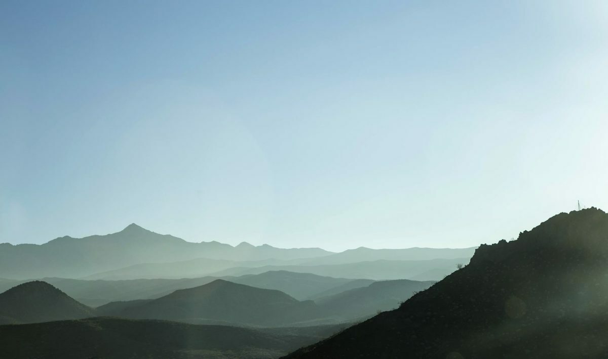
Among those processes that have been lost, we find some of the different ways that exist to create the illusion of distance within a painting. Among those widely known are mainly the different forms of linear perspective that are used in technical drawing and architecture. However, those that depend on color to achieve the illusion of planes and spatiality in a controlled way are not widely known.
How to create the illusion of distance through color is known as the theory of colors that move forward and backward. This subject is the one that contemporary artist David Berkowitz Chicago will touch on in this text.
Colors that advance and recede
The theme of colors that advance and recede in a simplified way is widely known. As the Chicago-based artist David Berkowitz explains, warm colors advance, and cool colors recede. Described in this way, this knowledge can be useful in design or in paintings where a very limited color palette is used, as it could be in color-field painting for example.
The most common example that is put of this phenomenon, that is to say, is that the red colors advance and the blues recede. Blue being a cool color it should feel deeper than red, which is much warmer when both colors are viewed side by side.
However, if when we are painting we are sincere about what we see then we will realize that this rule is not always fulfilled. Therefore, if we really want to understand what makes one color move forward and another move back, we must delve a little deeper into this topic.